Ashley Fronduto, Graphic Designer
Design
Portfolio
About Me
I am a Graphic Designer skilled in branding and environmental graphics.
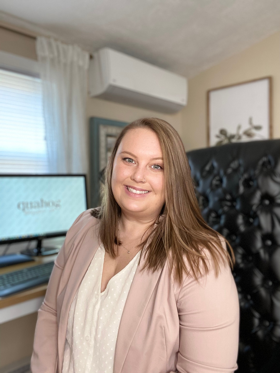
Hi, my name is Ashley, and I am a seasoned Graphic Designer specializing in branding, environmental graphics, and design production. Proficient in Adobe Creative Suite, typography, layout design, and web design, I excel in project management, crafting high-quality signage, and developing captivating brand identities. Known for surpassing client expectations, I bring innovative problem-solving and precise attention to detail to every project.

My Background
Experience
- Catalog Production Specialist (2021-Current)
- Freelance Graphic Designer (2012-2021)
- Graphic Account Executive (2016-2020)
- Graphic Designer (2014-2016)
- Business Development Coordinator (2012-2014)
- Graphic Designer Internship (2012-2012)
EDUCATION
Bachelor of Fine Arts: Graphic Design
University of Massachusetts Dartmouth
2008 - 2012, Dartmouth MA
SKILL SET
- Graphic Design (Print and Digital)
- Adobe Creative Suite
- Branding and Identity Design
- Typography and Layout Design
- Environmental Graphics
- Catalog Design
- Web Design (Wix, Wordpress)
- Creative Problem Solving
- Attention to Detail
- Project Management

LEAF
Design Approach
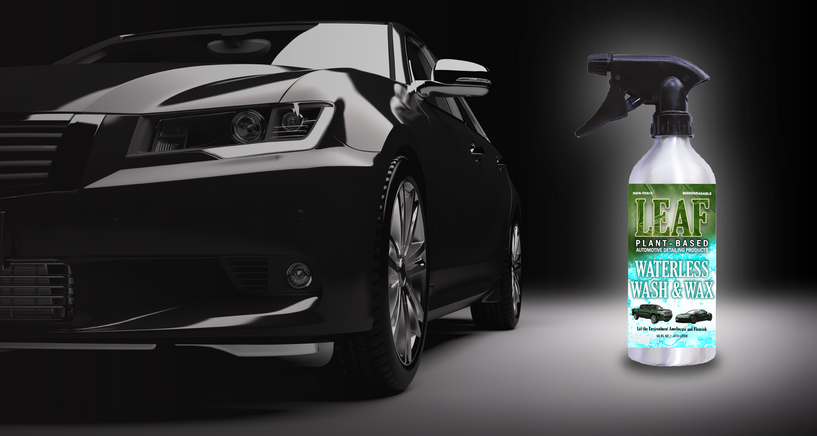
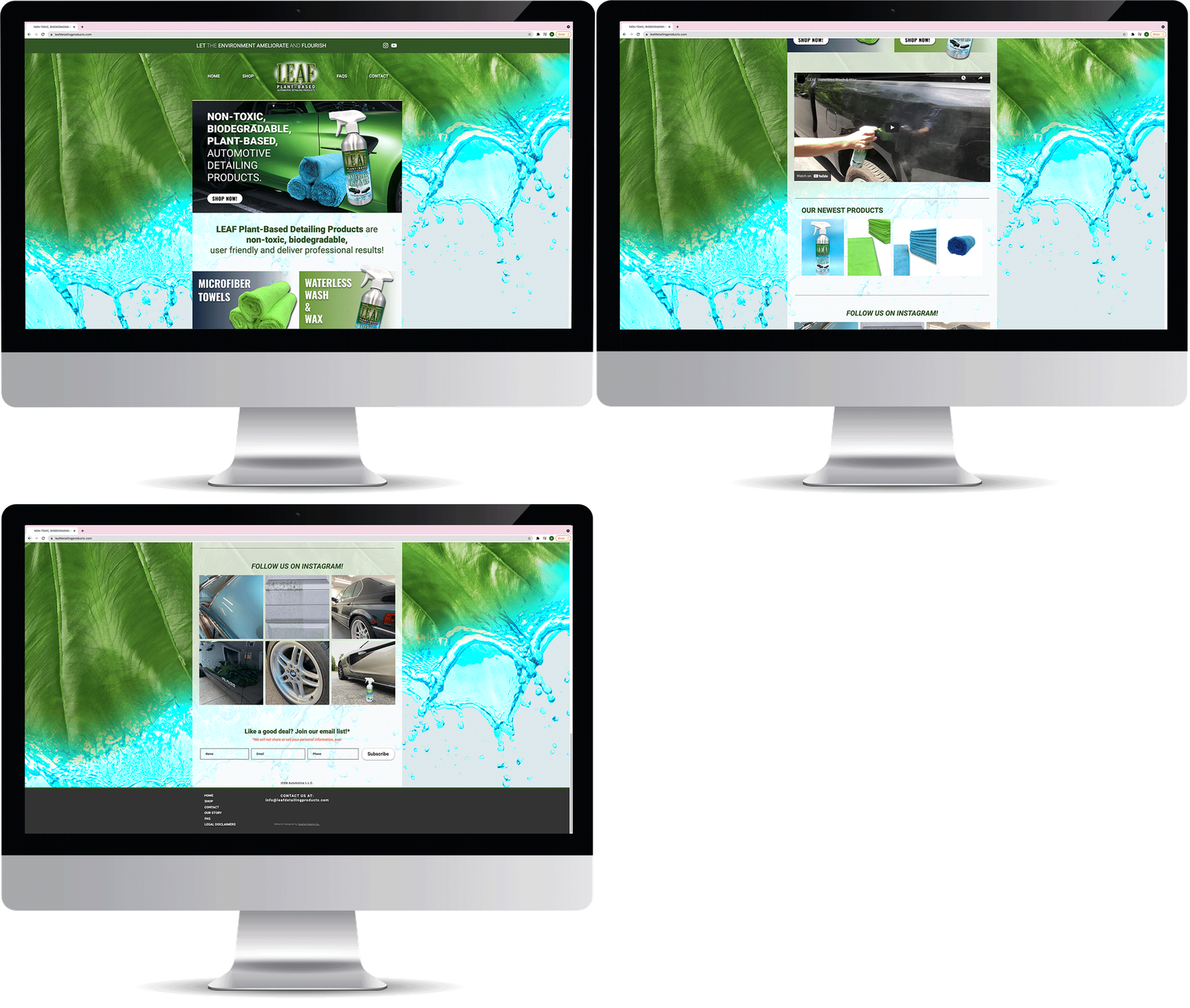
The design uses a green palette to highlight the brand's connection to nature. Leaf veining within the word "LEAF" adds a subtle visual element. The logo combines a stylized leaf with automotive elements, reflecting LEAF's focus on both environmental consciousness and automotive quality. Clean lines and modern typography ensure a professional and inviting look.

Outcome
The resulting brand identity not only captures the essence of LEAF as a brand committed to sustainability but also introduces a unique visual element. From the logo to product labels, the design effectively communicates LEAF's dedication to providing eco-conscious detailing solutions, with the leaf veining becoming a distinctive part of the brand's identity.
Conclusion
Working with LEAF was a rewarding experience, demonstrating how design can convey a brand's values. This project highlights LEAF's pioneering role in plant-based automotive detailing. The design elements effectively emphasize the brand's commitment to sustainability and innovation.
The European Cakery
Design Approach
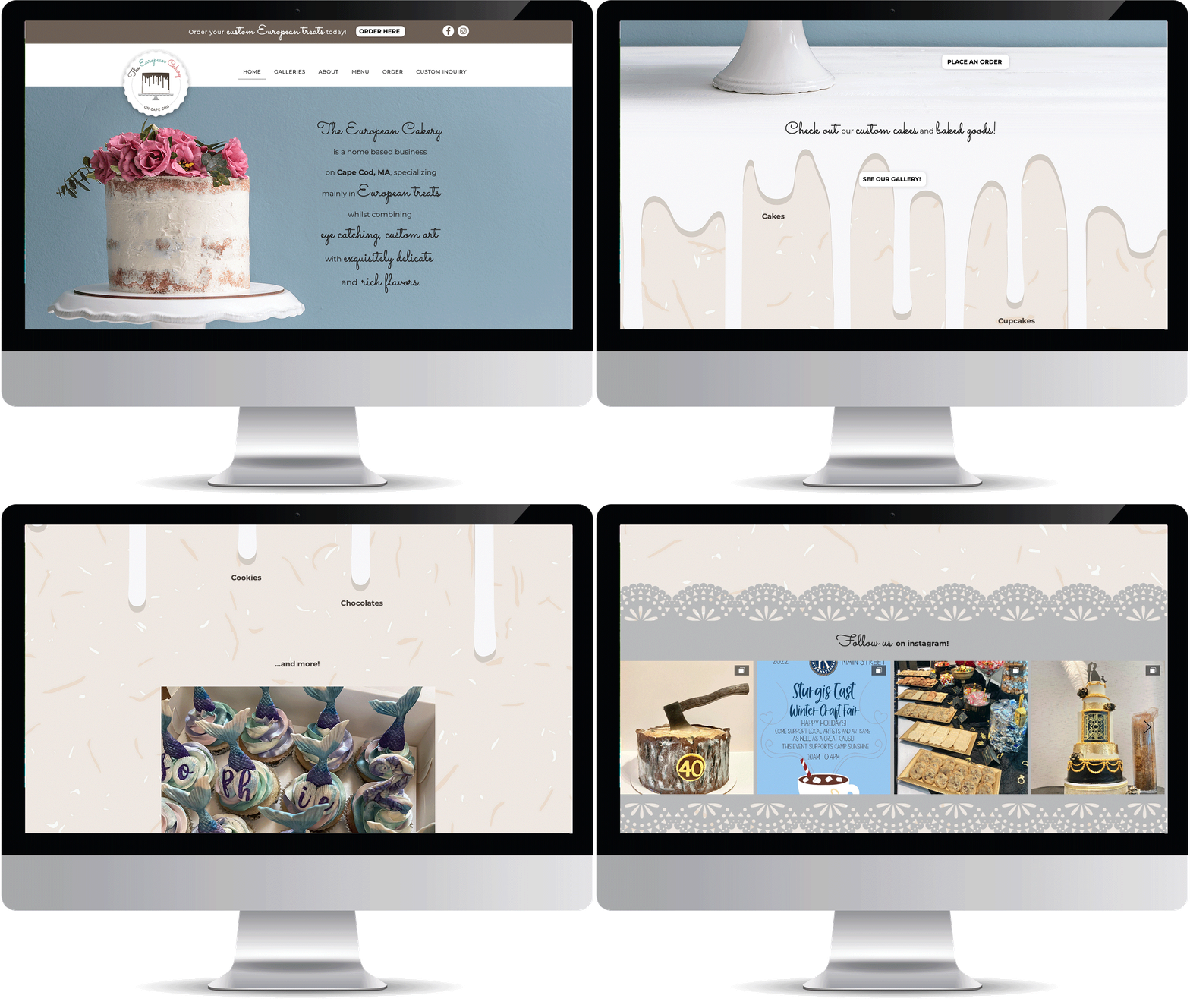
The challenge was to capture European elegance while keeping the design approach warm and inviting. A soft color palette reminiscent of European patisseries sets the tone. The logo, with script typography and a subtle emblem inspired by European motifs, adds a touch of artistry, reflecting the brand's commitment to the European baking style.
Outcome
The resulting branding identity beautifully encapsulates the sophistication of The European Cakery. From the logo to packaging, the design blends elegance with approachability, mirroring the experience of savoring Mirena's European-inspired delights.
Conclusion
Working with The European Cakery and Mirena Field was a delightful journey into European baking. This project showcases the playful design and the fun, authentic cakes that define The European Cakery, bringing refined European flavors to every dessert lover's table.
Max Beauty Studios

Design Approach
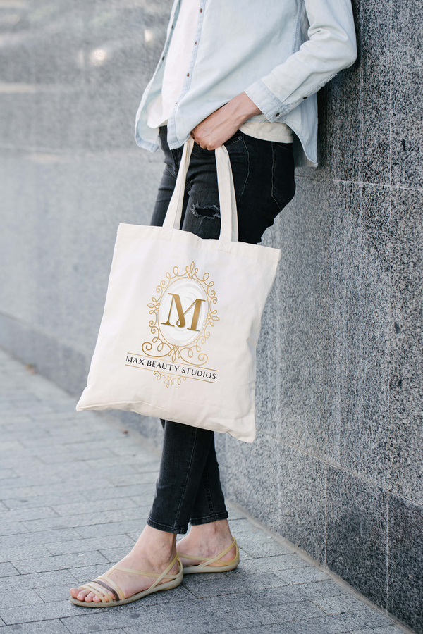
Max Beauty Studios, an elegant hair salon, desired a Victorian-inspired hand mirror logo to embody their brand's sophistication. I researched Victorian design elements, focusing on ornate patterns and intricate details. After sketching several concepts, I chose a design featuring an elaborate frame surrounding an oval mirror with the company’s initials prominently displayed in the center.
For the color palette, I selected gold and white. Gold, associated with luxury and elegance, perfectly aligns with the studio’s high-end services. White provides a clean contrast, ensuring the intricate details are visible.
OUTCOME
The final logo showcases a detailed Victorian-style hand mirror with the letter "M" at its center, symbolizing Max Beauty Studios. The ornate gold frame and white background provide a sophisticated design. The elegant typography for the company name is placed strategically below the mirror, balancing the composition.
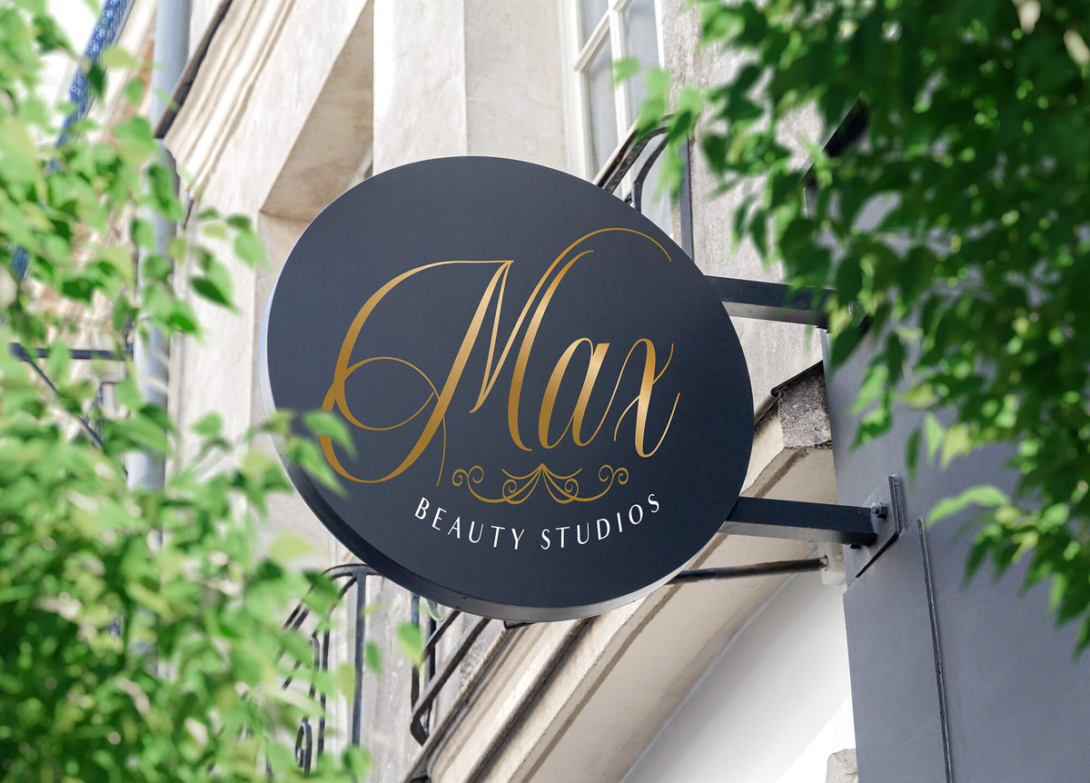
Additionally, I created a simplified version of the logo for signage and marketing materials. This version features the company name in a graceful script with a minimalist decorative element, ensuring brand consistency and practical versatility.
CONCLUSION
Creating the logo for Max Beauty Studios blended historical design with modern branding. The final product captures Victorian elegance while representing the studio’s luxurious services. This project highlights my ability to adapt to client requests and deliver comprehensive branding solutions, including versatile logo variations.
Good + Simple Wellness
Design Approach
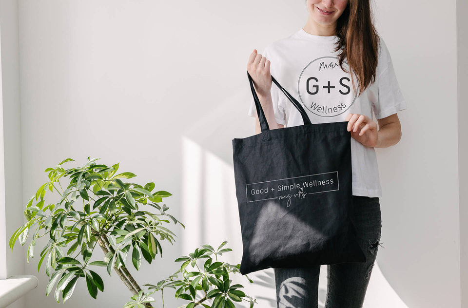
Our goal was to visually convey the holistic approach of Good + Simple Wellness, reflecting Meg's dedication to sustainable habits. The challenge lay in creating a visual identity that felt professional yet approachable, mirroring the inclusive atmosphere Meg cultivates for her clients.
Outcome
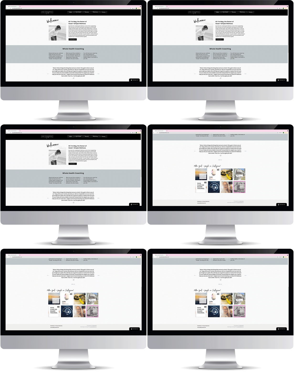
The brand identity features a sophisticated black palette and minimalist design reflecting Good + Simple Wellness's values of modernity and sustainability.
Conclusion
Collaborating on the Good + Simple Wellness branding was a journey in creating a visual identity that not only communicates the brand's values but also resonates with its audience. This brand identity stands as a visual testament to the impact of design simplicity, where a bold, inviting logo plays a pivotal role in reflecting the essence of a wellness brand committed to sustainable habits for a healthier, happier life.
Tails of a Baby Unicorn

Design Approach
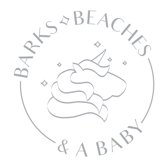
Sara, the poet behind "Tails of a Baby Unicorn," wanted a logo that encapsulated her Instagram poetry about love, loss, motherhood, and life's adventures. I aimed to create a whimsical yet introspective design, reflecting the emotional depth of her work.
I started with sketches combining a unicorn, symbolizing magic and transformation, with flowing lines to evoke the fluidity of poetry. The color palette of soft pastels and silver accents was chosen to convey tenderness and enchantment.
Outcome
The final logo features a minimalist unicorn silhouette with a flowing, heart-shaped tail that subtly forms a poem’s quill. The lavender, blush pink, and silver accents create a dreamy, soothing aesthetic. Delicate, handwritten typography enhances the personal feel of Sara's poetry.
Additionally, I designed a simplified version for social media and smaller branding elements, maintaining the core elements for consistency.
Conclusion
The logo for "Tail of a Baby Unicorn" blends whimsy with emotional depth, capturing Sara’s poetic voice. This project showcases my ability to translate a client’s story into a visually compelling logo, enhancing her presence on Instagram and beyond.
The Fresh Hook
SCOPE OF WORK
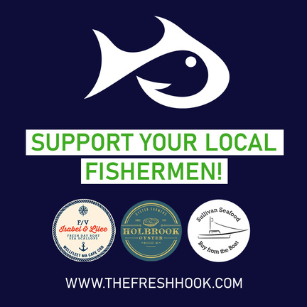
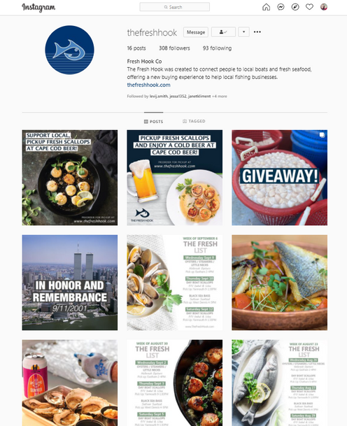
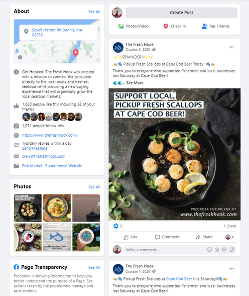
At the Fresh Hook, I leveraged the existing branding to create engaging content and marketing materials for Facebook and Instagram. I designed visually appealing social media posts and campaigns that resonated with the audience, enhancing the brand's online presence. Additionally, I created cohesive print designs for marketing purposes, ensuring brand consistency across all platforms.
